Inkscape is one of the most popular free software vector drawing applications. With minimal effort you can achieve some excellent results. However, for the inexperienced it can be a bit hard to find out how to get those results. In this tutorial I'll look at creating a simple ribbon effect which will hopefully introduce some of the key Inkscape features along the way.
Tools of the trade
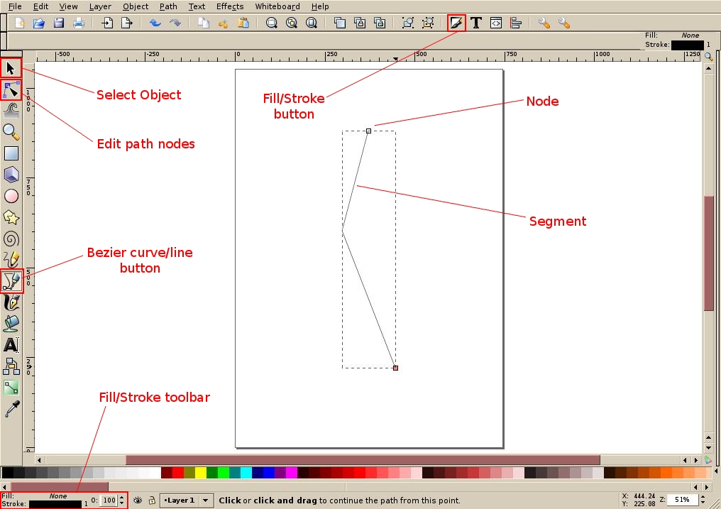
Before I start, you should know that for this tutorial I will be using Inkscape 0.46 on Debian Sid. Don't let the apparently low version number put you off, Inkscape is pretty stable. It does have some quirks to iron out but it's a while since I last had crash on me. Besides murphy's law would suggest that it is always prudent to regularly save your work anyway. Figure 1 shows a typical layout of Inkscape interface. I've picked out a few buttons that I'll be referring to through this tutorial.
For the benefit of the complete beginner: Inkscape is a vector drawing program. That means that it creates graphics which can be scaled without adverse effect on quality. These won't be photos or other such graphic work, but more usually they are found in logos, clipart and other places where the image may be scaled up or down. If you enlarge a small photo or bitmap image you get pixelisation and "jaggies". Do that with a vector graphic and you'll find the linework is as smooth as the smaller version. Inkscape uses the open standard Scalable Vector Graphic format (svg), but it will import popular vector formats like Adobe Illustrator and wmf. In this instance I'll start with a new file anyway. I'll assume you have Inkscape installed and open.
By the way, the screenshots will have lost a little quality to keep the size down; so, apologies if it looks a little blurred (where it's not supposed to be).
Create a basic curve
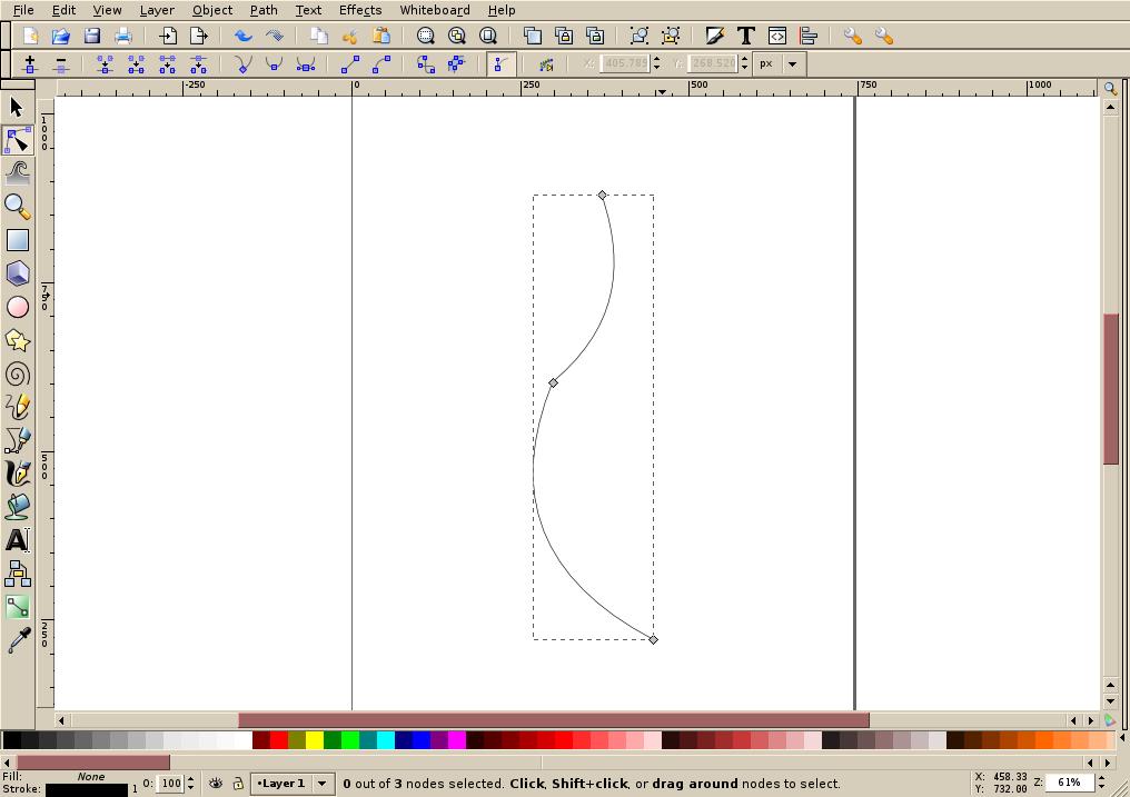
For this ribbon we'll need a bezier curve to start, as shown in figure 1. Click the Bezier curve tool button and click twice down the page to create two points on our curve (it doesn't matter if they are in line with each other at this stage). Double click further down for a final point to finish the curve. These points will be joined by straight lines – not very curvy, so we need to edit the curve. Click the Edit paths by nodes button to show us all three nodes (handles) on our curve (see figure 2).
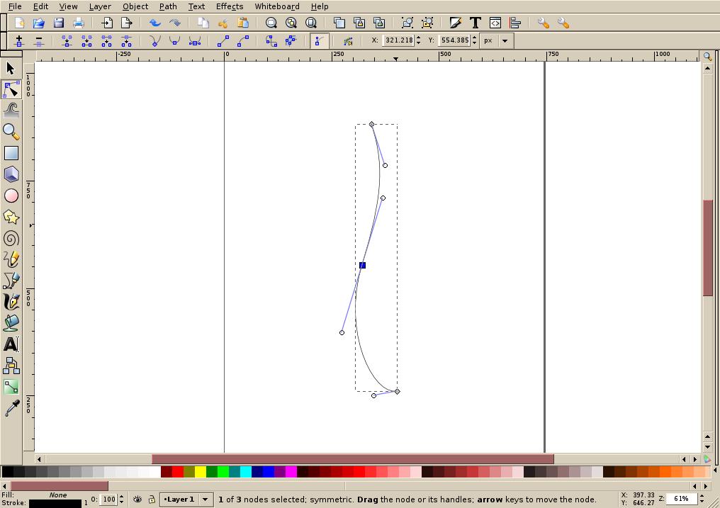
Now click on one of the segments (lines) and drag it to create a curve between the two corresponding points. Do the same with the other segment to create a kind of reverse S-shape. You'll notice the centre of this curve is still quite angled. We can smooth this by changing the middle node. Click on it and then click the Symmetrical node button to make it smooth. You'll also notice you now get additional handles for each node which you can use to adjust the – err – curve of your curve. Try having a play with them, when you are done make sure you have something resembling figure 3.
Making the basic ribbon
To give your ribbon thickness you need to duplicate our curve. Click the Object select button and if your curve is not automatically selected, click once on it. Now duplicate it by pressing CTRL+D. The new curve is placed directly on top of the original. You need to move this horizontally but not vertically. The easiest way to achieve this is to change the X co-ordinate shown on the toolbar. Add 50 to it to give your ribbon some width. When you move focus away from the X co-ordinate box the new curve will be moved. Note that if you are working on a smaller or larger object you may have to adjust some of these coordinate figures accordingly.
To fill your ribbon, you need to join these two curves into a single object. Draw a box around both curves to select them and then press CTRL+K (or Path->Combine) to combine them. Once that is done, click the Edit paths button again and draw a box around the bottom two nodes. They will turn blue. Now click the join button to join these two with a new segment. This segment will be curved: YOU need it to be a line; so, click it and then click the Segment-to-line button. Repeat this for the other end so we have a single closed curve.
The ribbon still looks a little flat though. It needs to be given some perspective. Click the Edit path button again and move the modes on the right hand side so they are not inline with the left. Also give it a pinch effect in the centre and you can slightly bow the end lines we just created if you want as well.
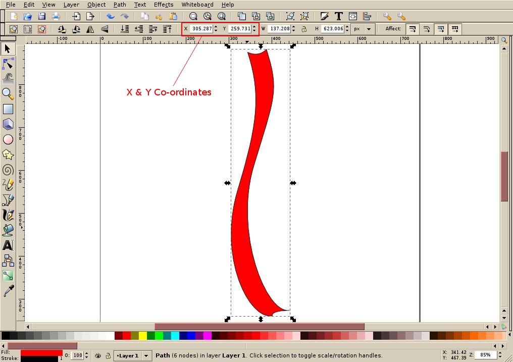
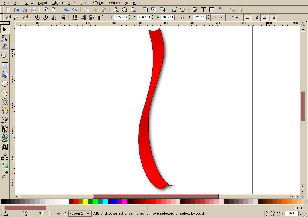
Finally, add some colour to Your ribbon. I'm in a festive mood: click the red colour swatch from the colour toolbar at the bottom of the page. This will set the fill for the ribbon to be red. You can choose any colour you like. It's possible that your chosen colour will be a little transparent. For the basic ribbon you need to have opaque colours; so right click the fill toolbar at the bottom left and select Make fill opaque. Now you should have something resembling figure 4.
Giving it depth
You could stop here, but apart from the silhouette it doesn't really look like a ribbon! It needs depth. To do this you'll add shading and a drop shadow. Start with the shading.
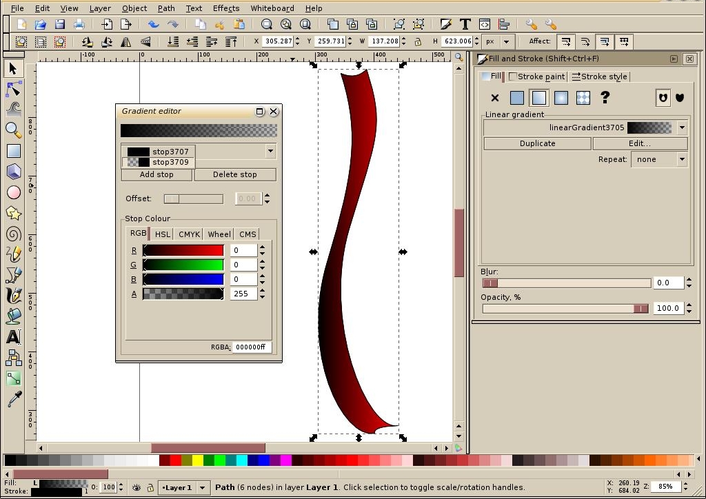
Select the ribbon and duplicate it using CTRL+D. Again the new ribbon is on top of the old one. With the new one still selected, left click the Fill colour on the bottom left. The Fill and Stroke dialog should appear. If it doesn't, click the "fill/stroke" button on the toolbar instead. In the new dialog, click the Fill tab and choose the linear gradient option. Inkscape creates a new gradient using the existing colour, but you can't see it because it's the same as the main ribbon underneath. Click the Edit button to open the gradient editor. Now change the main colour to be black. Then pull down the stops drop down and choose the other stop (which is the other "end" of the gradient) – change this to be black also but make sure the Opacity (A) remains at zero for this one – see figure 5. Close the Edit gradient dialog.
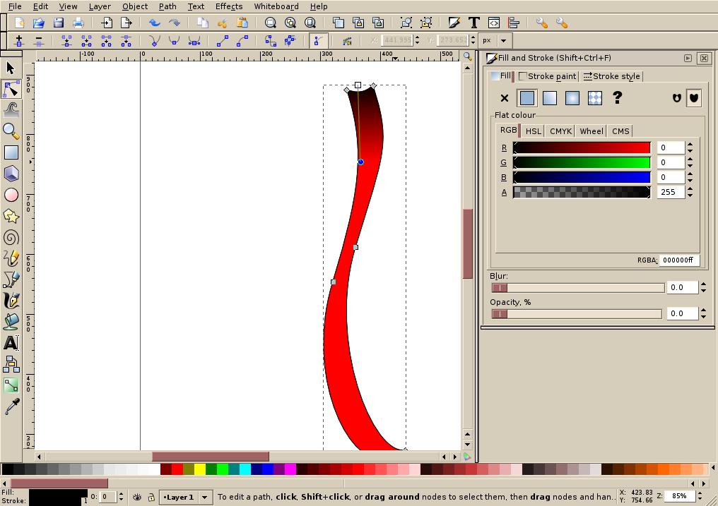
With the Fill dialog still open click the Edit paths button again. You'll now see additional nodes showing where the gradient starts and ends. Move these so the gradient runs vertically along the ribbon from the top to midway down the first bend – see figure 6. Now click the Select object button again and go back to the linear gradient fill page on the Fill dialog. Under "Repeat", select reflected. The gradient should now be reflected along the length of the ribbon. It's still a little dark; so change the Opacity to 20%. It also needs a little less clarity; so change the Blur to 1. Last of all, you no longer need the stroke on this shading; so click the Stroke tab and remove the colour by clicking the X.
Final flourish
The last touch is to give it a drop shadow. To do this duplicate either of the ribbon objects using CTRL+D. This will give you a new ribbon. Using the Fill dialog set the colour to a solid black. Also set the Blur to 3 and the Opacity to 70%. Now add 5 to the X coordinates and subtract 5 from the Y coordinates. This will move the object slightly down and to the right. Next you need to drop it behind the other objects. Click the Lower to bottom button to do this.
That should give you a basic and reasonably realistic ribbon effect like figure 7. Play around with colours, shading and shape as much as you like.
Like most tutorials this really is scraping the surface of what can be done. as they say, practice makes perfect!
References
- Inkscape website – http://www.inkscape.org
- Inkscape discussion wiki – http://wiki.inkscape.org
- Official tutorials – http://inkscape.org/doc
- Tavmjong Bah's Inkscape guide (book)